Evolving a product used by 1.4M+ creators
Summary
For fifteen years I was the design lead on Balsamiq Wireframes, a tool over 1.4 million people use to think through ideas. I evolved its design across web, native Mac, and Windows, rebuilt core workflows like text editing and commenting without breaking anyone's muscle memory, and extended the craft into AI features, writing the prompts and evaluation criteria behind them.
The Challenge
Balsamiq Wireframes is used by over 1.4 million designers, product managers, and developers worldwide. They choose it for one reason: it gets out of the way and lets them think through ideas and find the right design.
But a tool that’s been in market for over a decade accumulates friction. Core workflows that made sense in 2010 had developed gaps, and expectations shaped by tools like Figma meant that what once felt fast now felt constrained. We needed to modernize the core experience without breaking the trust and muscle memory of millions of users.
The work was less a visual refresh than surgery on a living product: re-imagining how core interfaces and workflows behave while keeping the tool stable, familiar, and effortless to learn.
Identifying the Gaps
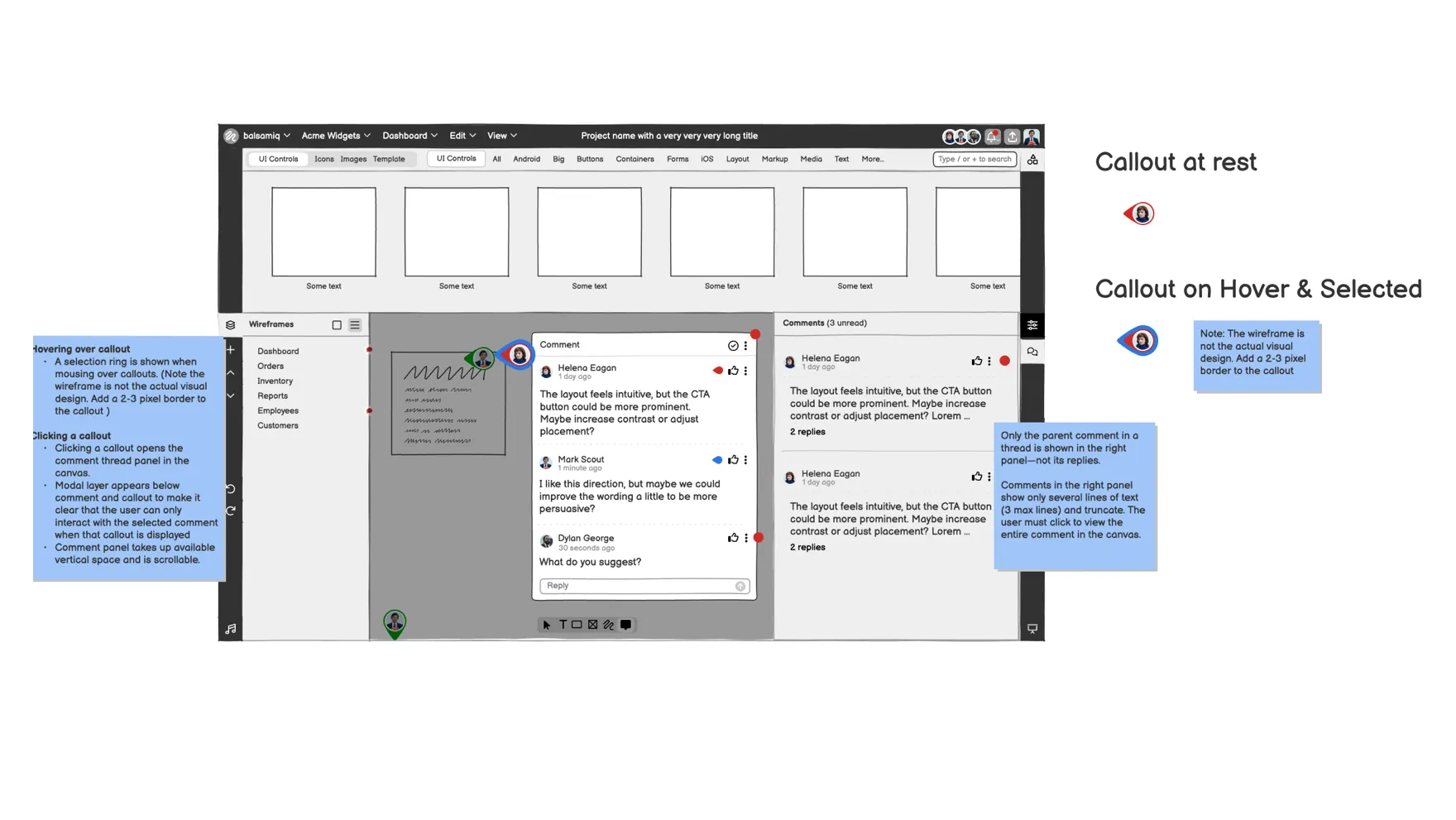
Commenting worked out in wireframes first, in the tool itself, before engineering committed time
Discovery kept pointing at the same places. Text editing, commenting and review, and canvas navigation were where the tool was actively slowing people down.
I paired the quantitative signals, support tickets and feature requests, with user interviews and contextual observation, and turned them into a prioritized map of usability gaps. The point was to separate what was genuinely costing people time from what they merely wished for. Basic behaviors like WYSIWYG text editing landed in the first pile, and so did commenting and review, the core of how teams collaborate in the tool.
Each gap was a different kind of design problem. Canvas navigation no longer matched how people actually worked. Editing and commenting hadn’t kept pace with what modern editors taught people to expect. And the AI features were a new problem entirely, less about layout than about helping people reach better ideas and get to "done" faster.
Process & Craft
I led design from discovery through release: wireframes, visual design, prototyping, and design review with engineering.
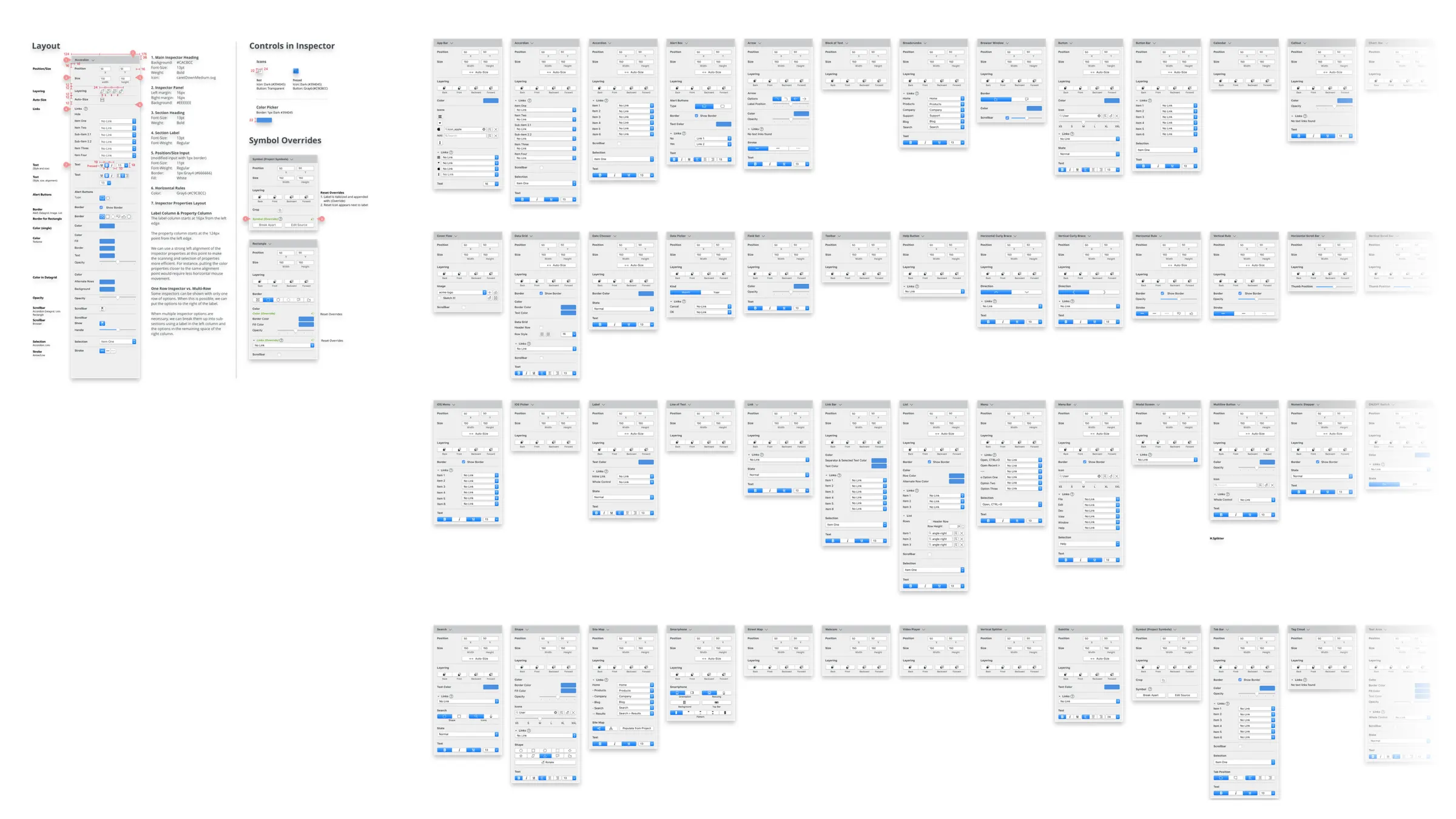
The workflow I established kept multiple parallel projects aligned. From the early years, when a small team shipped web and native Mac and Windows versions at once, I maintained the design system—component library, interaction patterns, platform-specific guidelines—that gave us velocity without sacrificing consistency. Wireframed flows and prototypes meant the product team always had a clear picture of the experience we were building toward.
For AI features, my role extended past traditional design. I worked with engineering on the system prompt, rules, and guardrails that governed the model’s behavior, contributed domain knowledge about how LLMs construct HTML to improve generative layout, and helped define the evaluation criteria we reviewed generated wireframes against. The feature went on to convert qualified trial users at 3–4× the rate of those who didn’t engage with it.
Rapid prototyping over spec-first
Instead of writing detailed specs and waiting for engineering, I prototyped solutions immediately and tested concepts in rapid cycles. Iteration collapsed from weeks to days.
Cross-platform consistency
I maintained shared UI design system guidelines, a component library, and design patterns that worked across Web, Mac, and Windows. Every improvement had to ship and provide a consistent user experience across all platforms.
Documentation as alignment tool
Wireframe specs and flow documentation were the contract between design and the engineering teams building the same feature on different platforms at the same time.
The Craft Up Close
Reflection
Fifteen years on one product is its own kind of design education.
Prototyping as thinking
Building functional prototypes forced sharper decisions earlier, and surfaced edge cases that wireframes and specs on their own would have missed. The speed was the least of it.
The cost of cross-platform
Maintaining three platforms created real design overhead. If I were starting over, I’d invest more heavily in the design system earlier to reduce the per-platform cost of every decision.
Trust is the product
For a tool people use daily, reliability is a feature. Every change, no matter how small, had to be weighed against the risk of breaking established workflows.
AI requires new design muscles
Writing prompts and evaluation criteria for AI features was a fundamentally different design skill than layout and interaction. It required thinking in probabilities and acceptable ranges rather than deterministic states. The job became building a quality loop, not drawing a screen.
The best wireframing tool disappears. Every feature we added had to earn its place by making users faster, not by making the tool more impressive.
Project Details
Previous Case Study
← Taking a product from idea to App StoreNext Case Study
Turning personal knowledge into action →